← Work 006 / 007
Brand Stewardship Dual Brand Direction Pharma Regulated Industry

BioLife & Takeda

Two brands. One parent company. One Art Director — holding two completely opposed visual systems in parallel, every cycle, with zero crossover.

Scroll
Clients
BioLife & Takeda
Role
Art Director — Both Accounts
Agency
Radancy
Structure
Simultaneous
Parent
Takeda · 80+ Countries
Industry
Pharma & Life Sciences

The hardest part wasn't designing for two brands. It was making sure they never looked like
the same one.

BioLife and Takeda are owned by the same parent company but operate as intentionally distinct brands — each with their own visual identity, brand voice, audience, and positioning. Both needed sustained recruitment marketing creative programs running simultaneously. The challenge wasn't producing at volume. It was holding two completely different brand languages in your head at the same time and never letting one bleed into the other.

In a regulated pharmaceutical environment, where every deliverable goes through compliance and legal review before going anywhere, the pressure to default to safe, interchangeable creative is real. The work on both accounts had to resist that pull — staying distinctly BioLife on one account and distinctly Takeda on the other, every cycle, without exception.

Client Context

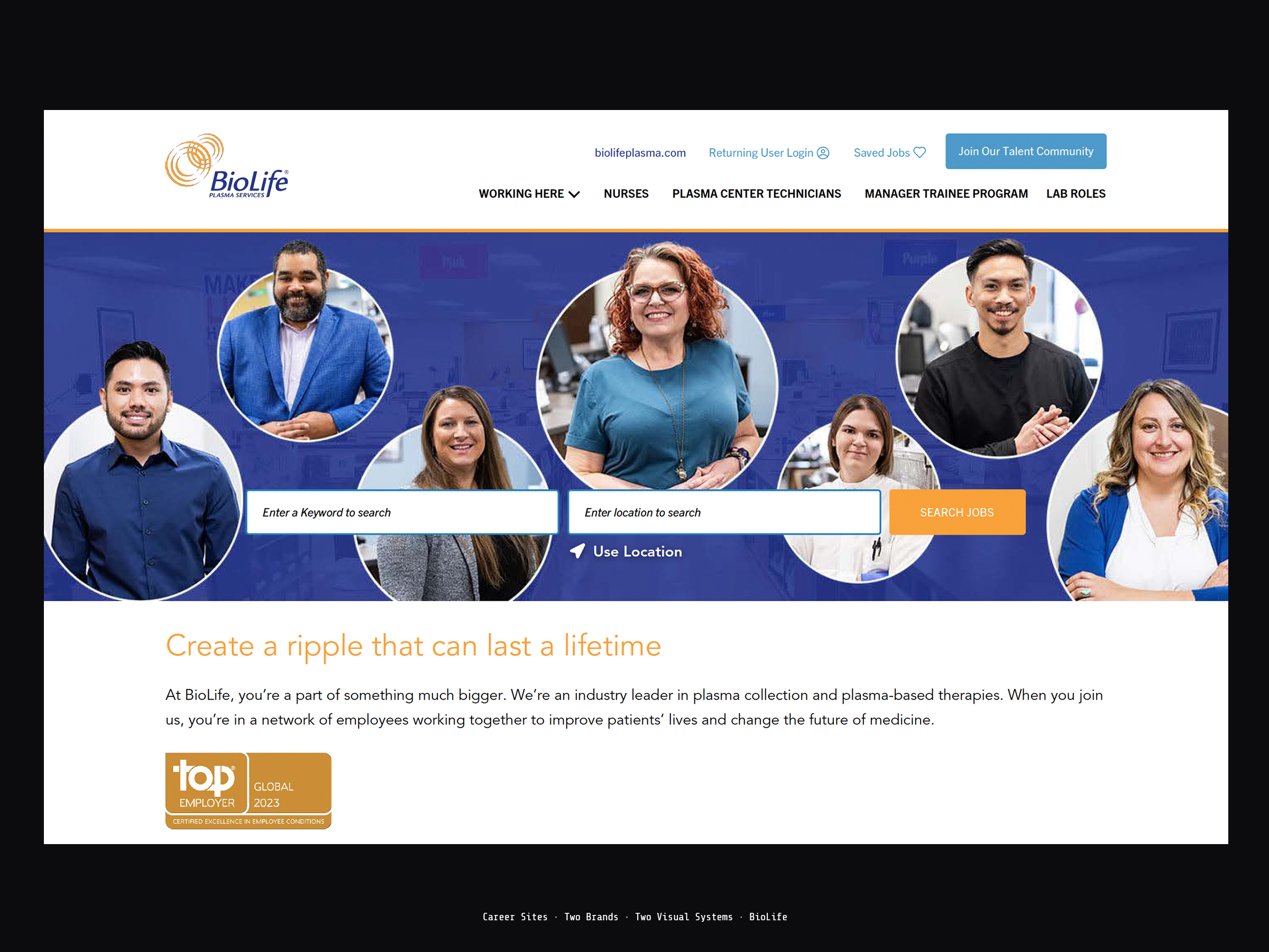
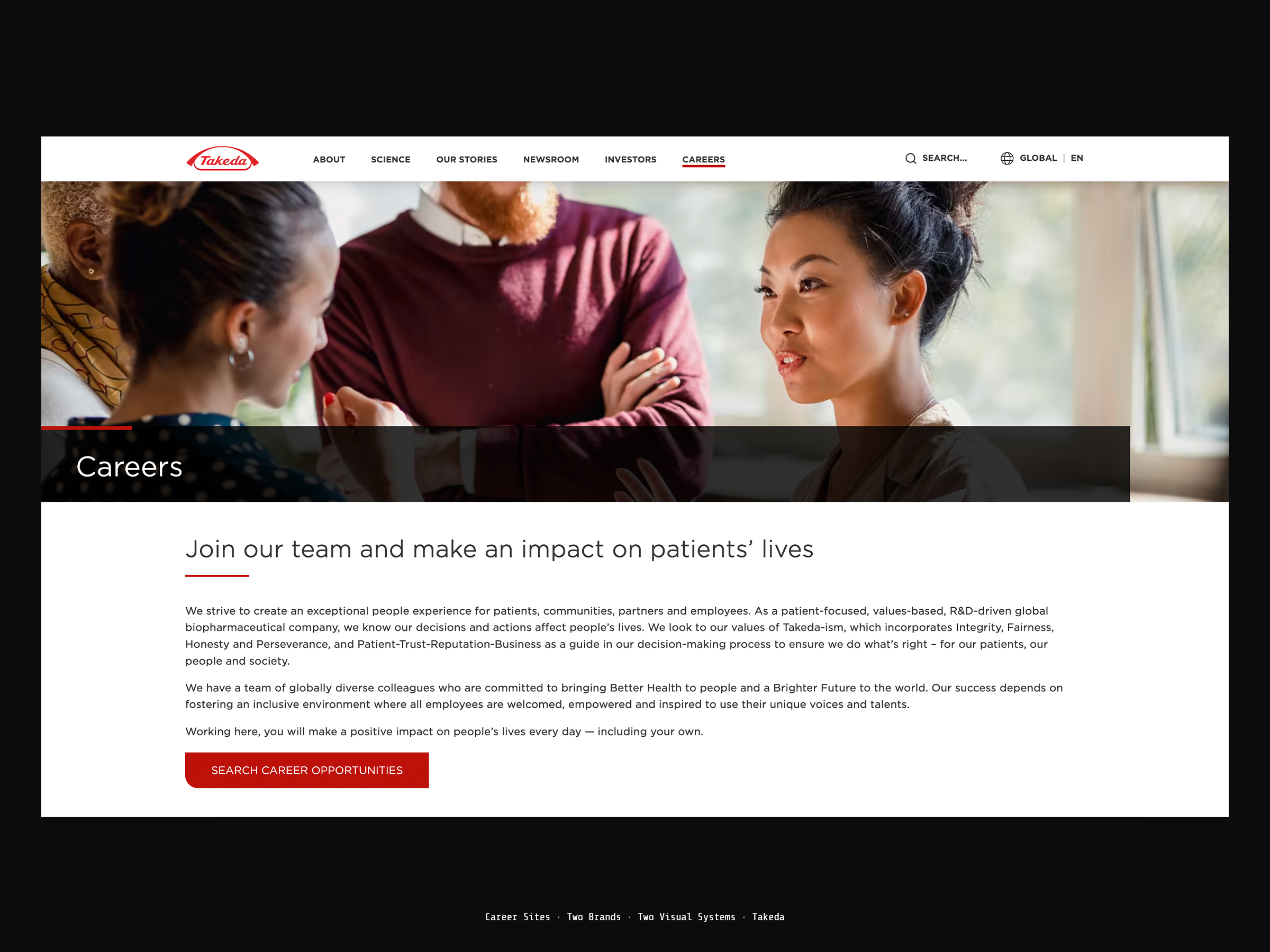
BioLife Plasma Services is a consumer-facing plasma donation brand — warm, accessible, community-oriented, designed to speak to everyday donors and healthcare workers in their communities. Takeda is one of the world's leading biopharmaceutical companies, operating in 80+ countries, certified Global Top Employer and Great Place to Work in 25 countries. Same corporate umbrella. Entirely different audiences, entirely different brand voices, entirely different creative problems.

Brand 01
BioLife Plasma Services
Consumer-facing plasma donation brand. Warm, approachable, community-rooted. The creative has to feel human and accessible — speaking to donors and healthcare workers in the language of care and community, not corporate enterprise. The design challenge is warmth at scale: making a high-volume medical service feel personal.
Brand 02
Takeda Pharmaceuticals
Global biopharmaceutical enterprise. Sophisticated, mission-driven, operating across 80+ countries with the brand authority of a company that has been shaping medicine for over 240 years. The creative has to project precision, purpose, and global scale — attracting scientists, researchers, and clinical professionals who choose employers the way they choose their work: deliberately.

Two brands. Same parent.
Different DNA.

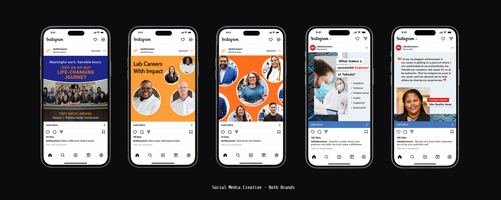
I was the Art Director on both BioLife and Takeda — primary creative on each account under CD direction, owning all art direction decisions and execution independently across both brands simultaneously. During high-volume periods I directed additional designers and offshore resources to maintain output across both accounts without letting either brand's standard drop. The organizational discipline required to run two pharma accounts with opposing brand personalities — inside a compliance environment that reviews everything — is the defining skill this engagement demonstrates.

Title
Art Director — primary creative on both BioLife and Takeda simultaneously
Team
CD above. Additional designers and offshore resources directed below during high-volume production cycles.
Scope
Career site creative, digital advertising, social media, print, and signage — maintained across both brands in parallel
Constraint
Pharmaceutical industry compliance — strict regulatory review on all communications across two distinct brand systems

Every discipline produced twice — once for BioLife, once for Takeda — every cycle, without crossover. The table reads as the engagement's defining structure: identical scope, opposed brand execution.

Discipline
Brand 01 BioLife Plasma Services
Brand 02 Takeda Pharmaceuticals
01
Career Site Creative
Brand TreatmentWarm, human, community-rooted. Plasma donation positioned as everyday care work — accessible, local, and personal.
Brand TreatmentAuthoritative, mission-driven, globally scaled. Pharma research positioned as deliberate, sophisticated, world-shaping work.
02
Digital Advertising
Brand TreatmentApproachable banner systems across all standard sizes — prospecting and retargeting tuned to local donor and healthcare-worker audiences.
Brand TreatmentPrecision-driven banner systems across all standard sizes — built for scientific and clinical talent in enterprise digital environments.
03
Social Media
Brand TreatmentEmployer brand content built to feel human and community-facing in a consumer-style social feed — warmth as the primary signal.
Brand TreatmentEmployer brand content built to project mission, scale, and global purpose in a professional feed — authority as the primary signal.
04
Print Advertising
Brand TreatmentRecruitment print in publications reaching local healthcare and donor-adjacent audiences — accessibility held at full print resolution.
Brand TreatmentRecruitment print in trade publications reaching clinical and scientific professionals — authority held at full print resolution.
05
Signage & Large-Format
Brand TreatmentFacility and event signage tuned for community-facing physical spaces — brand warmth surviving format change from screen to wall.
Brand TreatmentFacility and event signage tuned for enterprise and clinical environments — brand authority surviving format change from screen to wall.
2
Distinct brand systems maintained simultaneously — opposing brand personalities, zero crossover between them
5
Disciplines produced twice every cycle — career site, digital, social, print, and signage, each brand executed separately
0
Brand crossover incidents across the engagement — the discipline of the work was that the work never blurred

The hardest part wasn't designing for two brands.
It was finishing the engagement without ever blurring them.

Managing two brands under the same corporate umbrella that intentionally maintain separate identities requires a specific kind of creative discipline — resisting the pull toward visual consistency and instead holding two distinct brand languages simultaneously. Delivered sustained, brand-accurate recruitment marketing creative across both BioLife and Takeda across every format and every production cycle, maintaining visual system integrity and brand voice distinction between a consumer-facing plasma services brand and a global enterprise pharmaceutical company. That's not execution. That's brand stewardship.

◈   Art Director & Designer   ◈ Remote Only  ·  No Relocation